
Data is the plural for datum – or individual data items. So when we think about analysing data we are probably already thinking “data set” rather than about the constituent “datum”. Perhaps that’s why we’re quite comfortable to accept aggregate descriptions of the data – e.g. average – as a starting point. So potentially we’re already one step removed from the underlying raw data.

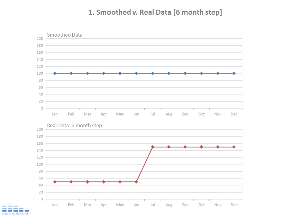
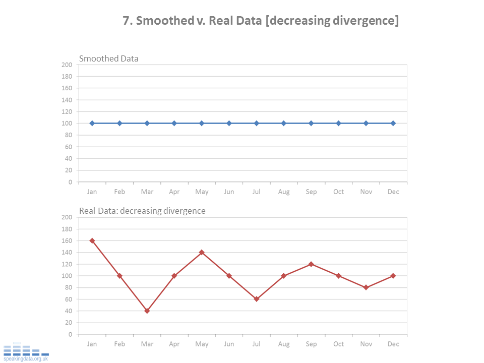
Data smoothing is one way that’s been used to look for underlying patterns in those datum. A typical approach being to smooth data over time, maybe smooth monthly data over a years, to see more macro, perhaps seasonal patterns. However this can so easily hide also hide all sorts of interesting micro patterns.
The examples below show how a range of scenarios when simply smoothed, hide the real patterns of interest. These examples use a 12 month rolling average (mean) and show this for a 12 month period. In each scenario, the real data follows repeats the same pattern over 12 months...
Perhaps less data smoothing, more datum smothering…..


And for a more helicopter view of the underling patterns....

So as soon as we distance ourselves from that underlying data we are potentially distancing ourselves from the underlying questions and messages. Exploratory Data Analysis has been a champion of staying close to the underlying data, using approaches which try to reflect more of the original data in the calculations and visuals. And this is perhaps helpfully reborn into the current world of data visualisation, where we see a stronger sense of “datum” over “data”.
NOTES: The real data.
This is the matrix of data. For each series, the same annual pattern is followed each year. This graphs show the last 12 months data, the raw underlying data being the same as the previous year. This is based on the principle that if the data point that drops out of the rolling average is the same value as the new data point that enters, the rolling average remains unchanged.
