No Silver Bullet

There are so many management terms and tools that it can be more than a little difficult to see the wood for the trees.   Vision, purpose, strategy, objectives, plan, programmes, projects, performance, change, risk, outputs, outcomes….. And then there’s the relationships, dependencies and even overlaps and contradictions that link these things together.  So that’s a lot of potential activity between defining a purpose and a outcome.


There are even published compilations of “Management Models”, including those from the Financial Times which list just the 60 every manager should know.  Of course there is no silver bullet, rather the prudent application of some fundamentals, and an overall grip on those so that they integrate and pull in the same direction.  So definitely not “off the self” but rather a set of tools relevant to specific circumstances. …less “set menu”, or even “À la carte”, but more “mezze”. 

So here’s my one page take on the key components, and their broad relativity. Not a panacea but a sense of order and structure.  At least as a map by which to navigate that wood of trees…


So that's the broad framework.  Here's the mapping of (1) leadership business, (2) managing business, (3) managing business change and (4) delivering business.

1. Leadership Business: Why and What


So some top level leadership defining the purpose, plus the objectives to achieve that purpose, and ensuring that these are sufficiently clear and specific, and engaging people on this. From these all else flows.  There may even be some preferred values which shape and steer subsequent behaviours.  Leadership is probably less head and more heart,  art rather than science, and character than personality.  So in simple terms it’s about strategy, the why (…we do what we do) and the what (…we are going to do).

2. Managing Business: How


Management is then about the planned delivery of that purpose and objectives.  That’s more head than heart and more science than art.  So it’s the plan  - the how - that makes a reality of that purpose (why) and objectives (what).

So a bit like a strategy in military conflict, at least there’s a clear starting point, even though this will adapt and adjust with application in the operational environment.  After all the term strategy is derived from the military – the plan of action to achieve a specific objective.

3. Managing Business Change


As the Greek philosopher Heraclitus stated in 500BC "The only thing that is constant in life is change".  And as echoed by Disraeli “Change is inevitable. Change is constant”.  Whether that’s (a) a virtuous circle of continual improvement, (b) a neutral circle of change for the sake of change (c) a repetitive circle of history forgotten, or (d) a vicious circle of decline, it all needs to be managed while still delivering. 

4. Delivering Business: Doing


That plan is implemented through processes, people and projects to deliver outputs and outcomes to customers.  So this is the actual doing.   That activity is probably monitored and steered through some combination of performance, portfolio, programme and project management, especially where things are changing.

So....

It’s often the case that many of these management tools operate to independently from the others (and there may even be specific post holder for each of these roles).   Where finance, risk, performance and change are all aligned and focused in the same direction, they respond collectively and efficiently to that purpose and objectives.

If fact one of the simplest and best macro approaches is the well-established police approach of  gold/silver/bronze command.  Most notably because this has stood the test of time as fashionable models come and go.   The gold commander makes a decision about what needs doing (…seal the football ground).  The silver commander works out how to achieve that (…a team on each entrance/exit, plus a mobile spare).  And the bronze commander(s) actually do it (…present and responsive on each entrance/exit).  Also the Gold commander will openly seek and take expert advice from specialist advisers (negotiation, public order…) as part of that decision making process.  A simple and effective framework to structure the broader suite of components.

So a map by which to navigate that wood of trees…not the only map nor indeed the perfect map.  At least a functional map, with a clearer view of the landscape, with some places visited and some places yet to be explored.


A Framework for Performance Information

There are frameworks and there are frameworks. The latest best practice data management framework is that provided by the Code of Practice for Official Statistics published by the UK Statistics Authority (see Statutory Statistical for the overview).

While designed for the public sector it's based on more generally applicable principles which hold fast in other sectors.  However that is quite detailed, and while outcome focussed, there are 74 business practices to consider. So it's worth being open to some of the predecessors who facilitated the preliminary debate and did some of the earlier consolidation in a simpler way.  Not necessary simple, just simpler.


Notably is the Framework for Performance Information - "FABRIC".  A joint product from the National Audit Office, Audit Commission, Office for National Statistics, Cabinet Office and HM Treasury.  The irony is that a decade on the Cabinet Office and HM Treasury are now legally bound to be compliant with the UK Statistics Authority Code of Practice. What goes around, comes around.

Like all such frameworks they tend to give you the "test answers" rather than the "workings" to get there.  But perhaps more frustratingly, there can be lots of good content that can seem more than a little unconnected...framework, criteria, components and so on.  So here's that Framework for Performance parts summarised, and the big picture distilled.


A. Framework for Performance Information

How performance data relates to the business...


B. Criteria for Individual Performance Measures

So what makes a good measure...

C. Components for Managing Performance Measures

Planning, assuring and using measures.   And mapping on the relationship with Framework (A) above...


D. Corporate Performance Framework - Distilled.

So this is my take on what that framework might look like if integrated and presented as a whole, to get a better sense of the relationship of those parts.  Developed from the various elements, this is structured this around the nature of business activity - which is after all is the focus of performance measurement - in terms of corporate activity (resources, inputs, processes, outputs and outcomes) and corporate success (economy, efficiency and effectiveness).


Statistically Speaking

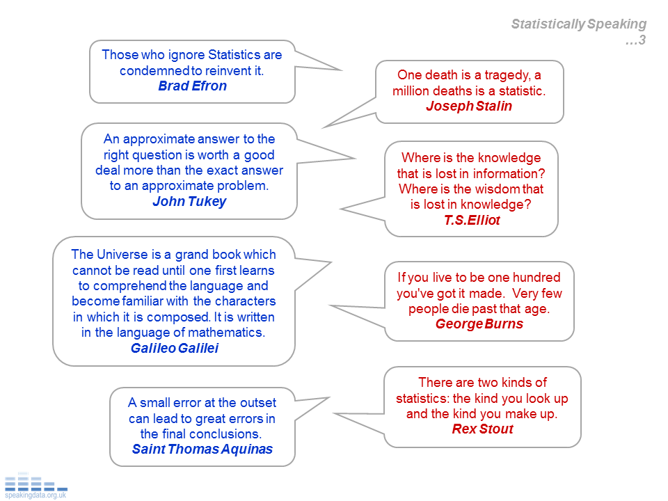
Do numbers really speak for themselves?  Sometimes. Mostly it's the words that really speak...."That's the best satisfaction we've achieved in the last 15 years, and well above the typical level for the sector."

So here's a dip into my collection of statistically related quotes.  So can these words capture the essence of the world of numbers?


Analytical Insight

In the world of analysis, it’s common to have some data and some outputs from the analysis of that data.  There might even be a structured process for that analysis (even an analysis strategy with some direction, structure and flexibility).  So usually some inputs (data), process (analysis) and outputs (data).  But the real purpose for all of this is about making something happen or change, to make things better and that’s the eventual purpose or outcome.

So here’s the overall road map for the journey, through data, analysis, and the often plentiful outputs.   Not quite so many squares as a monopoly board, but a journey all the same.


[The data components are described at…Data Provenance. And the analysis process at What a Performance, and the propensity for that analysis to be successful at Analytical Insight Index.]

The reality is that there’s a lot to get right.  That’s 12 data activities either explicitly – more worrying implicitly – need to be dealt with before the analysis.  Then 6 factors to influence the success of an analysis, including 6 components to consider in the analysis strategy.   So 24 activities by here.  Then there’s the outputs.  Much more options here but often multiple products of combinations of words, numbers and visuals.

The key point is that shortcuts, omissions or mistakes effect the validity of everything than follows.   And it’s a long one way street.  Decide to categorise in a specific way for data collection and you’re probably stuck with it ….. ask individuals their age and record in 10 year age bands, means that you can’t differentiate into 5 year bands later down the line.   Equally, poor validation means that the errors associated with that becomes implicitly (and even unknowingly) present in the analysis and messages that emerge.  In short, errors compound during the journey.   In the words of Saint Thomas Aquinas in the 13th Century… “A small error at the outset can lead to great errors in the final conclusions”.  The principle also nicely illustrated by the WW1 quote  (although of questionable authenticity)  “Send reinforcements, we're going to advance” which became “Send three and fourpence, we're going to a dance”.

So if that’s all done well enough and we have some confident outputs, it can be quite a leap from outputs to making things happen.  How do those outputs turn into outcomes?  To get real outcomes means really engaging people, and that is perhaps the realistic proxy outcome here: getting sufficient engagement to facilitate and drive those changes for the better.

That’s about getting understanding or more specifically, Insight, defined variously as
 ..... to perceive clearly or deeply
..... a penetrating (and often sudden) understanding  of a complex situation or problem;
 ..... the act or result of understanding the inner nature of things;
 ..... the power of acute observation and deduction, penetration, discernment;
 ..... Psychology…. the capacity for understanding one’ own mental processes
..... Psychiatry…. the ability to understand one's own problems.

Insight is where things can get a bit more “heart” and bit less “head”, more “art” less “science”, and perhaps more fundamentally more “internal” and less external.   Turning those physical products full of words, numbers, graphics or visualisation into personal understanding in the minds of others. But insight is more than understanding observations, more about understanding messages and meaning in a broader context. 

Those output products emerge from a broadly internal process to become external product(s), so basically inside-out.   Insight is a more about an outside-in take on that analysis. Looking at that analysis from the point of view of its context, and that of key stakeholders. 

A useful seen stakeholder approach will be to:

(1) test or challenge a message to check it’s underlying robustness - if necessary unpacking those proceeding data and analysis steps.  Could be considered as a “depth” check.

(2) check the scope of analysis to see that the relevant factors are included, and the relevant context reflected, and tested against some external wisdom or benckmark.  Could be considered a “breadth” check.

So helpful to look at those analysis products in a different way, with increasing stakeholder interest and engagement. So:

Step 1. Cover the Angles: Ensuring that the scope of consideration is complete, priorities reflected and analysis robust.

Step 2. Synthesis: Consolidating that analysis into a single integrated, coherent, even holistic, perspective.  More than simply the whole being greater than the sum of the parts, more about making connections to see relationships, influences and dependencies as clearly and simply as possible.   

Step 3. Key Messages:  Distilling the complexity and meaning to the smallest number of most strategic messages.


So in short, taking an outside-in view and make messages as simple as can be, while respecting and reflecting the underlying complexity, relationships and context.  To paraphrase Einstein “Make things as simple as possible, but not simpler.”


Analysis Recipe Card

There are real similarities in language between cooking and data analysis….as previously described (slow Roast Data).

To take this relationship a step further, it’s quite possible to consider the analysis process to be just like a food recipe.   Basically they are the same processes…. some ingredients, a process to work with those ingredients, to create something to bring out the best in those ingredients.

Perhaps this is really just a project plan, with some inputs, process and outputs. The data are the ingredients, analysis of that data represents the cooking process, and the finished meal is the outcome.   To push this further then we might like to think beyond output to outcome.  So not just a meal that provides functional energy, but one which is a pleasure ride for the senses, sight, smell, touch (texture), taste and even hearing (think sizzling, steak, peppers or indian tandoor).  So an analysis that really delights, finds new truths and drives progress.

After all, for the food that hits the spot, it’s not unusual to hear…can I have the recipe.  Perhaps this is the test we might like to hear for a good piece of analysis.  This also provides that sense of ‘repeatabiliy’, the rigor of science, and potentially a useful audit trail in the right circumstances.

So here’s my recipe card.  In fact it refers to some real analysis looking at the senior civil service salaries and their corresponding variation in financial responsibility.....(For Whom the Buck Stops)


Data Smoothie

Data is the plural for datum – or individual data items.   So when we think about analysing data we are probably already thinking “data set” rather than about the constituent “datum”.  Perhaps that’s why we’re quite comfortable to accept aggregate descriptions of the data – e.g. average – as a starting point.  So potentially we’re already one step removed from the underlying raw data. 


Data smoothing is one way that’s been used to look for underlying patterns in those datum.  A typical approach being to smooth data over time, maybe smooth monthly data over a years, to see more macro, perhaps seasonal patterns.   However this can so easily hide also hide all sorts of interesting micro patterns.
 
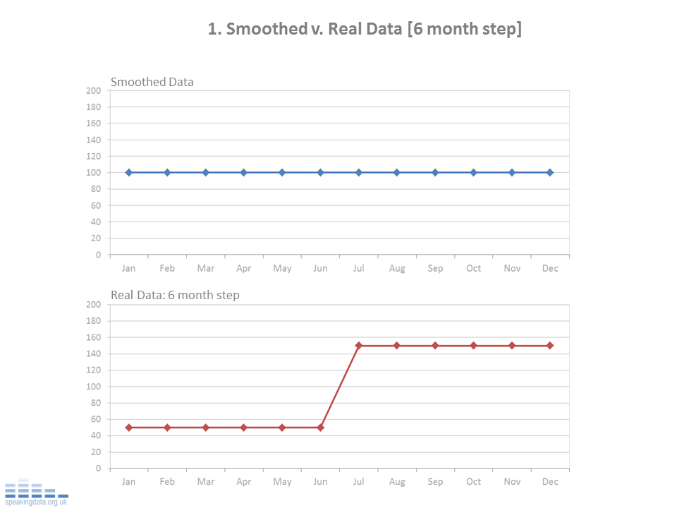
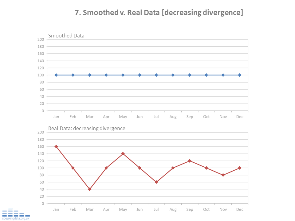
The examples below show how a range of scenarios when simply smoothed, hide the real patterns of interest.    These examples use a 12 month rolling average (mean) and show this for a 12 month period.  In each scenario, the real data follows repeats the same pattern over 12 months... 

Perhaps less data smoothing, more datum smothering…..

And for a more helicopter view of the underling patterns....


So as soon as we distance ourselves from that underlying data we are potentially distancing ourselves from the underlying questions and messages.  Exploratory Data Analysis has been a champion of staying close to the underlying data, using approaches which try to reflect more of the original data in the calculations and visuals.  And this is perhaps helpfully reborn into the current world of data visualisation, where we see a stronger sense of “datum” over “data”.

NOTES: The real data.

This is the matrix of data. For each series, the same annual pattern is followed each year.  This graphs show the last 12 months data, the raw underlying data being the same as the previous year.  This is based on the principle that if the data point that drops out of the rolling average is the same value as the new data point that enters, the rolling average remains unchanged.  

For Whom the Buck Stops

In the work of open data we are only starting to see the mix/mash/mesh of the various data.  Given that data.gov.uk already has over 5600 data sets, this might start with linking any two data sets and potentially linking up to 5600.  That’s where reality gets a grip.  The scope is technically challenging –only some data will be effectively linkable to selected others - and the general capacity and incentive to do this probably insufficient right now.

Also at the moment there’s a lot of data news, visualisation and apps.  And like news, there’s a new data topic or two tomorrow, with a new visualisation and app to follow.  But this is not the same as insightful analysis that moves the debate on by distilling and consolidating messages.  So lots of opportunities for taking some proper analytical time, and getting into the key messages and questions, not just from a single set of data but also by considering some simple linkage.

Helpfully the Law of Diminishing Returns might suggest some early benefits from the more straightforward linking of simple key data, rather than too many of the more complex data.   Here’s one example of the opportunity to start to make some relevant connections.  Perhaps the simplest example of the basic need for that connection and context, and the extra insight that is possible.  

The case in point is the publication of the salaries of those civil servants earning over £150k per year.
There are 345 top players, who are collectively paid £58m.  Looking overall, that £58m works out on average £170k salary per year per head (some part-timers in the mix, and based on the lower salary band).  But is that good value?   

But the list of salaries of the top public players, does not give a sense of relative worth, just their relative pay.   Helpfully, what’s clear from the Comprehensive Spending Review – and the range of departmental budgets - is that some jobs are definitely bigger than others.  The means with variable salaries and variable budget responsibilities, some might well have more responsibility for each £1000 of their salary than others.

Those 345 senior staff collectively manage annual spending of £696bn (Comprehensive Spending Review 2010/2011).  So in simple average terms:

-          - That’s about £2bn managed per person per year, or

-          - Every £1000 of salary comes with £12m of budget responsibility, or

-          - Each £1 of salary buys £12,000k of budget responsibility.

If we look at this in another way, this is less about salary paid, more about the total risk being managed.   In total £58m is what we pay for the effective management of £696bn, £1000 management salary for each £12m of spend.   Is that about right?

However: (1) there are more senior and less senior folk in that pool of 345 top civil servants, and the key point here is that there are a smaller number of senior departmental staff – the Permanent Secretaries - with whom the buck eventually stops; (2) the spend per department is quite variable; (3) for a more complete picture there is also some revenue collection responsibility to take into account.    So we really need to unpack these three dimensions to get better sense of salary worth – basically who’s having to work hardest.

1.       Super Senior Staff

The buck would tend to stop with the Permanent Secretaries of each department, as the most senior civil servant.  However that does not necessarily mean that they are paid the most in their department.  There’s a scattering of roles across the departments where the Perm Sec is paid less than others in the department.  This includes the Chief Information Officer at the Department for Work and Pensions, several at the Department for Business Innovation and skills, Finance Director at the Home Office and Chief of the Defence Staff.   In addition these 345 roles also cover the Arms Length Bodies (Quangos – Quasi-Autonomous Non Government Organisations), where some senior salaries are higher than the Permanent Secretary of the department who’s arms they are at the end of.   All a function of the real world at play.

Of course this tends toward recognising a “top team” approach with collective shared responsibility.  However there is still a responsibility and accountability hierarchy in place, given the importance of the roles and the public resources at stake.  And that avoids that conundrum…about four people named Everybody, Somebody, Anybody and Nobody:

There was an important job to be done and Everybody was sure that Somebody would do it.  Anybody could have done it, but Nobody did it.  Somebody got angry about that, because it was Everybody's job.  Everybody thought Anybody could do it, but Nobody realised that Everybody wouldn't do it.  It ended up that Everybody blamed Somebody when Nobody did what Anybody could have done.

So the focus here is on those 17 Permanent Secretaries from the Departments, and for whom the buck eventually stops.

2.       Departmental Spending.

The Comprehensive Spending Review lays out the government spending plans over the next five years and by government department.  There’s a Total Managed Expenditure of £696bn in 2010/11, which is broken down into (in the simplest terms) (a) capital and resource spending and (b) externally committed spend such as benefits (called Annual Managed Expenditure) and more variable spending such as running costs (called Departmental Expenditure Limits). 

The focus here is on the departmental spend which is broken down by department, and which represents the substantive volume and variability.  However there’s plenty of complexity around this and generally excluded here as they are generic rather than departmental spending, most notably: accounting adjustments (£22bn gross); depreciation (£16bn); reserves (£8bn); and debt interest payments (£43bn).  This also excludes: £60.4bn collective spend for Scotland, Wales and Northern Ireland; £39bn allocated to local government; £2.1bn for Small Independent Bodies; and HM Treasury with a negative expenditure of £2.4bn in 2010/11.  The Cabinet Office is still included, while one of the smallest spending departments, the head also functions as the head of the Civil Service and paid accordingly.

So the identified departmental spend  amounts to £500.5bn which is directly allocated to the 17 Departments as follows:

So that £500bn spend is managed delivered through the 17 most accountable senior staff.   That makes for a much sharper financial responsibility than spread across the collective 345 members of “top teams”.   The collective salaries of those 17 staff is £3.1m.

So again in simple average terms:

- That’s £29bn managed per person

- Every £1000 of salary comes with £161m of budget responsibility 
(rather than £12m per £1000 when spread across the 345 top team)

- Each £1 of salary buys £161k of budget management.

The top 5 departments account for 80% (£400bn) of the spend, and at the other end of the scale, half of departments have a budget of under £10bn. There’s more variation in the departmental budgets than there variation in salaries,  so this clearly points to some having relatively more financial responsibility for the same level of salary.

So at one extreme, the Work and Pensions Perm Sec gets £195k and is responsible for £159bn of public funds.   So each £1000 of salary brings with it a responsibility for £815m of public funds.  
Then it is the NHS, for which each £1000 salary has a financial responsibility for £404m.  Then its education with £337m responsibility per £1000 salary.  HM Revenue and Customs at £236m and then Defence at £221m.

Then there’s the majority pool of smaller spending departments (under c.£100bn).  And at the lower extreme the Foreign and Commonwealth Office Perm Sec gets £175k salary and is responsible for £17bn.  So each £1000 salary brings with it a responsibility for only £10m of public money.  

So that difference in financial responsibility for each £1000 of salary varies from £815m (Work and Pensions) to around £10m (FCO).    That represents a factor of 80 times more responsibility for each £1000 of salary.  That’s either 80 times more responsibility, opportunity or risk depending on your viewpoint.

In short, reward and risk not evenly distributed, and in fact hugely variable.  

So to look at this another way.  What it everyone was paid relative the level of financial responsibility?   First let's use the FCO salary level of £175k for £17bn of responsibility as the benchmark.  Then the Work and Pensions salary would rise from £195k to £15m a year.  Or if we standardise the other way around and use the Work and Pensions as the benchmark £195k salary for £159bn financial responsibility, then the FCO salary drops from £175k to £22k per year....

3.       Departmental Income.

Just to complicate things further, some departments also generate revenue.  While some of this might be indirect (every £1 spent on the British Library – arms length body of Dept. Culture, Media and Sport- generates £4 for the UK economy), some of this is very direct revenue collection.  
The Budget 2010 shows that Government income (“net receipts”) totalled £548bn.  Of this, over three quarters, £419bn was raised through HMRC.  That’s through Income Tax (£150bn), National Insurance (£99bn), VAT (£81bn), Excise Duty (£46bn) and Corporation Tax £43bn.


So while HMRC have a spend responsibility of £40bn, they also have a collection responsibility of £419bn, so a collective annual financial responsibility of £459bn.   So for HMRC that salary comes with even more responsibility.   Which means that the original £236m of financial responsibility per £1000 salary at HMRC increases to £2448m.  (Strangely HMRC seem to have two Permanent Secretaries, so even if this £2448 gets shared that’s still over £1220 per £1000 salary.)

So comparing that HMRC £2448m budget per £1000 salary to FCO of £10m, that now represents a factor of nearly 250 times more financial responsibility per £1000 salary.  So definitely not all jobs are equal.

So….

So a relatively straight forward data mix up… take some senior civil servant salary data, mix in some headline comprehensive spending review departmental spends and budget revenue data. 

What represents a relatively small variation in absolute salary terms, amounts to hugely variability  - up to 250 time more – in terms of levels of financial responsibility for the same £1000 of salary.   The question still begs, what is the right level of salary?  Where financial responsibility is high relative to salary, does this mean we are getting the best value for money?  Alternatively are we taking to high a level of risk in having such a low level of management costs relative to the level of budget responsibility?

This is really one of those "provocative-indicative" analysis.  Some simplifications and assumptions here but not to much as to distract from an overall message around relative disparity in salary and responsibility.  Of course financial responsibility is really just a proxy for overall responsibility, there are plenty of other factors at play.  The FCO has a management scope and complexity which is global in nature, quite unlike work and pensions. Similarly there will be certain responsibilities which are bigger than financial - including outside the mainstream departments - the Nuclear Decommissing Authority might well be a case in point (Chief Executive Salary of £365k).   As usual the numbers - the things we can measure more directly - both ground and open the discussion.

NOTES: There are some imperfections in all of this. The reality of course is that there is some legwork in getting to the data and making the connections.  Not only are the salaries in bands, but the data is provided as text rather than numeric fields.  So need to first mix in a few spreadsheet functions to covert text to numbers, and use the lower value of the banding.  So more of an approximation – although consistent - than exact measure.  Similarly whether salaries have been consistently defined across departments (to include all benefits standardised in the same way) we cannot be certain.